
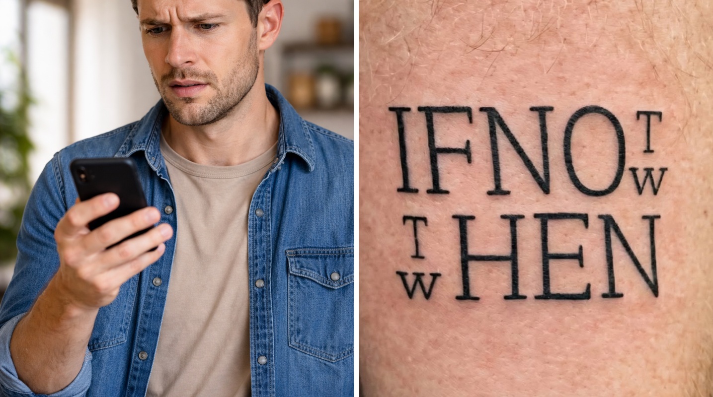
At first glance, it looks simple.
Thank you for reading this post, don't forget to subscribe!Just a few bold, cleanly inked words arranged across someone’s skin. Nothing outrageous. The sort of thing loads of people have tattooed on them, right?
Well… no. You see, if you’re going to get something – a quote, for example – you might want to make sure people can actually read it and not have to sit down to decipher it.
Yes, a photo of the tattoo has gone viral across Reddit, Instagram, and other social media platforms sparking confusion, debate, and a flood of hilarious reactions — all centred around one question: What does it actually say?
The tattoo features large, capital letters arranged in a stacked layout. But instead of reading cleanly from left to right, the spacing and alignment throw your brain into chaos.
Now, yes, after a few moments, the majority of people will and have worked out that it says, “If not now, then when”. But that hasn’t stopped social media users from tears the inking to shreds for it’s nonsensical layout.
Letters overlap visually. Smaller characters sit awkwardly between larger ones. Your eyes jump between lines, unsure where to begin or end. As one person commented: “At first glance, it looks like a simple phrase, but the longer you stare, the less certain you become.”
As the image spread, people rushed to the comments — each jokingly convinced they had cracked the code. One user wrote: “If no hen, what then? No egg.”
Another didn’t hold back, joking: “This would be bad enough as a wood burned sign in some suburban mom’s kitchen. As a tattoo it’s yet another reason to wish for the global extinction of this foul species”
Meanwhile, others leaned into the chaos entirely: “IFNO HEN TW TW”
And perhaps the most fitting summary of the situation came from someone who admitted defeat entirely:
“Bro I still have no idea what I’m looking at.”
Some insist the answer is obvious. Others mock that confidence: “If notw thwen . . . Too easy”
Part of what makes the tattoo so confusing is how it’s constructed.
The design uses overlapping alignment and unusual spacing, with smaller letters placed between larger ones. This creates multiple possible reading paths — meaning your brain can interpret it in several different ways, but never all at once. The phrase also requires a comma, something that the tattoo lacks.
Some viewers read it cleanly. Others see complete nonsense. (Which is what makes it so darn fun.)
And once your brain locks onto one interpretation, it becomes surprisingly difficult to switch to another.
It feels like one of those intelligence tests you used to do in school, or one of those “only those with a high IQ” puzzles flooded on our newsfeeds.
But – most importantly – it is a reminder of why I have no tattoos.
Featured image credit: WorldManual/Reddit (screenshot)